We Are Changing Our Look
![]()
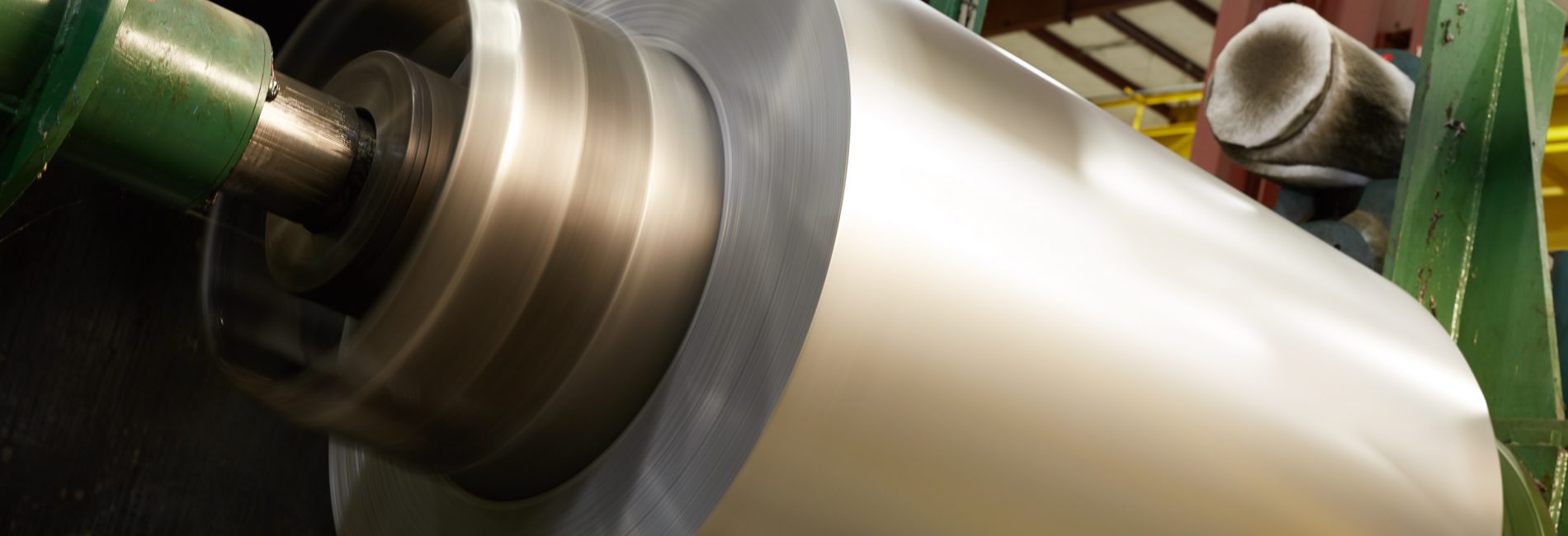
For people who know Magic Steel, the familiar brown and tan “MS” logo that has been with us since Magic Steel started back in 1974 symbolizes many things. Excellent customer service and support from an experienced and knowledgeable team. Integrity knowing that Magic will always stand behind their commitments. A premium product from a service center that only deals in prime material from tier 1 domestic mills. Technical competency with state of the art equipment and a fully equipped metallurgical lab to provide the quality product you expect as well as the technical expertise when you need it.
While those who have worked with Magic over the years know our commitment to these ideals, our logo has not done a good job of portraying them or communicating them to new customer or potential new employees. To address this, our logo is changing:
![]()
The new logo helps to communicate the premium brand better than the old blocky “MS” while still paying homage to our history with the brown lettering, reference to our founder and president Joe Maggini – “Magic” and our long term commitment to the steel business “Est. 1974”. The Gold Star helps to communicate that we are a premium brand, while the point with the slit through it hints to our slitting background and makes the star unique to Magic Steel.
Over the next couple of months we will complete the transition to the new logo. Most business documents have already been changed, new business cards, letter head, envelopes have all been ordered, new signs are scheduled to go up on the buildings and our Website is receiving a major overhaul to better communicate our ideals and what Magic stands for. We are even shorting our email and web addresses from magicsteelsales.com to magicsteel.com.
It is our hope that the new logo better communicates to everyone regardless of how long they have known Magic Steel, they type of company we are, what we stand for and what we represent.